Posted February 21, 201411 yr comment_1334113 New uniforms will be unveiled March 5. The most obvious difference is the size of the logo, but the logo itself has been modified, with a different look to the skull and crossed swords. The red is more vibrant, the face mask goes from black to chrome-ish, and the pewter is a lighter shade that more-closely resembles actual pewter. I'm not sure why they felt the need to change the skull and swords, but whatever. But another thing they did was to remove some of the detail from the flag, and that wasn't a good change. Overall, I like the new look. It looks fresher. They may have gone overboard with the size of the logo, though. The old: The new:
February 21, 201411 yr comment_1334119 I think it looks ridiculous but I love when they try to change things. I like old school looks better and would love to see what it would look like without the flag. Just the skull ans swords
February 22, 201411 yr comment_1334287 it's ok...but I was really hoping to see this. when you have something that cool why do you change it? I guess young kids might think it looks old but I think it looks awesome. I love the old school stuff. I would sport a t shirt with that logo and I am not even a fan.
February 22, 201411 yr Author comment_1334290 That helmet is my favorite of all time. My basement is a museum of Reds and Bengals stuff from the 70s and 80s, but among it there is Bucco Bruce helmet stuff here and there. I love the red and orange together and wish more teams would use it.
February 22, 201411 yr comment_1334299 it's ok...but I was really hoping to see this. That is the gayest Sports logo of all time. Not that there's anything wrong with that ...
February 22, 201411 yr comment_1334328 Bruce was effing awesome! They never should have gotten rid of him.
February 23, 201411 yr comment_1334477 In response the Cleveland Browns also announced they too would triple the size of the logo on their helmet....
February 23, 201411 yr comment_1334491 Bruce was da bess. TB ranks #4 on my NFL fav list...behind Bengals, Iggles, and AZ. I basically followed them from their beginnings (loved John McKay) and especially during Sam's time there. Still have a Bruce sweatshirt and sweater.
February 23, 201411 yr comment_1334513 Bruce was effing awesome! They never should have gotten rid of him. I feel the same way... It was my favorite non Bengals sports logo of all time.. I like the Bucs as a child just because of the uniforms.
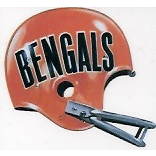
February 26, 201411 yr comment_1335114 suggested on another site, I think the keychain version would make a pretty cool real helmet.
March 3, 201411 yr comment_1335715 really? I think they're ugly, and I usually like when teams re-do their unis. Don't think the orange works, and I don't like that they ditched the pewter.
March 3, 201411 yr comment_1335725 These are pretty bad ass ... Did they drop out of the NFL and join the arena league? Maybe when the team is introduced before the game rather than running out from the tunnel into the dressing room they can have a tiny little car drive into the middle of the field and the whole team jump out one at a time accompanied by a seal playing "Send in the Clowns" on bicycle horns.
March 4, 201411 yr comment_1335862 suggested on another site, I think the keychain version would make a pretty cool real helmet. Looks like something from Pirates Of The Caribbean.
March 4, 201411 yr Author comment_1335875 Good lord, those are horrible. They might be just merely bad if not for the awful number font, but those numbers put these in a class by themselves. Easily the ugliest team in the league at this point.
March 5, 201411 yr comment_1335970 Did they drop out of the NFL and join the arena league? Maybe when the team is introduced before the game rather than running out from the tunnel into the dressing room they can have a tiny little car drive into the middle of the field and the whole team jump out one at a time accompanied by a seal playing "Send in the Clowns" on bicycle horns. All of this... Those are horrible.
March 5, 201411 yr comment_1336112 In response the Cleveland Browns also announced they too would triple the size of the logo on their helmet.... Next year we'll find out how badly Nike can fuck up a blank canvas. I'm guessing the Browns "cutting edge" makeover will include verticle striped socks, a two color jersey that resembles a tank top, and uniform numbers using the now familiar alarm clock font. Oh, and it will probably feature a team logo that can't do double duty as a paint chip.
March 6, 201411 yr comment_1336282 Next year we'll find out how badly Nike can fuck up a blank canvas. I'm guessing the Browns "cutting edge" makeover will include verticle striped socks, a two color jersey that resembles a tank top, and uniform numbers using the now familiar alarm clock font. Oh, and it will probably feature a team logo that can't do double duty as a paint chip. Tank top look for Cleveland unis is a must. Also, since it's Cleveland, the tank top should be matched with bermuda shorts two sizes too large, white tube socks, and black loafers. And if they can make their players somehow look like they're standing outside a Sons of Slovenia social hall, hammering down kielbasa on a white bread bun, that would be helpful as well.
March 6, 201411 yr comment_1336295 Tank top look for Cleveland unis is a must. Also, since it's Cleveland, the tank top should be matched with bermuda shorts two sizes too large, white tube socks, and black loafers. And if they can make their players somehow look like they're standing outside a Sons of Slovenia social hall, hammering down kielbasa on a white bread bun, that would be helpful as well. They say the helmet won't be changed, but I'm almost certain the new uniforms will feature an updated Brownie elf logo. Probably wouldn't be difficult to put a giant tubular meat sandwich in it's tiny little hands. The real question I think the Browns are facing is how many elf logos will Nike want to put on the uniforms, and will those 50's era throwback logos clash with 90's era clock radio fonts? Not to mention the danger of making the fake carbon fiber accents look a little bit too fake.
March 6, 201411 yr comment_1336312 I just don't see how anyone can "love" those old creamsicle unis and think the new ones a are "horrible". Different strokes I guess ...
March 6, 201411 yr comment_1336313 really? I think they're ugly, and I usually like when teams re-do their unis. Don't think the orange works, and I don't like that they ditched the pewter. Helmets are still pewter. The orange is in the logo and is also the creamsicle that everyone loves. I think these are the best they have had yet. But to me, that's not saying a lot, considering what they had.
March 9, 201411 yr comment_1336841 Yeah but all thirty-two teams will have to switch to a new kind of uniforms and helmets for the 21st century!


Archived
This topic is now archived and is closed to further replies.